9 Delicious Color Pairings That Make Kitchens and Dining Rooms Shine

What Are Some Timeless Color Schemes for Kitchens and Dining Rooms?

Classic color combinations create visual harmony and simple sophistication. All-white kitchens are a classic choice, but designers often suggest adding wood tones and textures to bring in warmth and keep the space from feeling too cold.
Blue and white combinations are a perennial favorite, creating a fresh, coastal feel perfect for relaxed get-togethers.
If you want a calm, nature-inspired feel, try pairing green and cream. This brings the peacefulness of the outdoors inside, creating a restorative environment.
To create a dramatic, sophisticated space, consider a bold combination of black with brass or gold hardware. It’s a look that feels both modern and truly luxurious.
How Does Color Affect Mood and Appetite in Eating Areas?

The colors in a room can have a surprising effect on your dining experience and even your appetite, a key principle in color psychology.
Warm, lively colors like red and orange are known to encourage conversation and hunger. This makes them great choices for dining rooms where social gatherings are the main event.
Yellow can promote happiness and energy, but it’s often best used as an accent. Too much bright yellow can feel overwhelming, so it’s best to use it in smaller doses.
On the other hand, cool tones like blues and purples can make you feel less hungry, according to some studies. This makes them less common in traditional dining rooms but a good choice for kitchens where you want to focus on mindful eating.
How to Use Warm Colors for a Cozy, Inviting Space

Warm colors like terracotta, rust, and rich amber are perfect for creating inviting dining rooms that help guests relax and connect.
These earthy hues cast a flattering, warm glow that makes dinner parties and family meals feel even better.
For those who prefer a quieter look, warm neutrals like beige, taupe, and mushroom offer the same comfort without being as bold.
These palettes are particularly effective in north-facing rooms. These rooms often get cooler light, so they benefit from the extra visual warmth, a principle noted by the experts at Decorilla.
How Can Cool Tones Create a Clean and Serene Look?

Cool colors such as mint green, pale blue, and soft lavender can create refreshing kitchens that feel extra clean and organized.
These colors tend to step back visually, which is a great trick for making small kitchens look bigger and more open.
Cool tones are a natural match for stainless steel appliances and crisp white countertops, creating a pulled-together, modern look.
Furthermore, they provide a calming balance to the heat and hustle of a busy kitchen. This helps make the heart of the home a more peaceful place to be.
Why Are Neutral Palettes a Foundation for Timeless Design?

Shades like greige, cream, and soft off-white create a flexible backdrop that can change as your style does over the years.
These flexible neutrals remain stylish through changing design trends, saving you the time and money of frequent repainting.
With a neutral palette, adding texture is key. It keeps the room from looking flat or boring.
Try adding elements like natural wood, textured tiles, a veined marble backsplash, or different metal finishes. This layering technique, often seen in publications like House Beautiful, adds depth and visual interest for a sophisticated look.
How to Unify an Open-Concept Space with Color

In an open-concept layout, color is your best tool for tying the space together while marking different zones. Start with a single base color for the main walls to serve as a calming, continuous backdrop.
One popular method is to use the same base color but in different shades or finishes for each zone. This creates a natural flow while letting each area have its own identity.
You can also use accent colors for specific areas—like painting the kitchen island or creating a feature wall in the dining area—to set spaces apart. Thoughtful color transitions help define functional zones without walls, a key strategy in modern design.
A colorful kitchen island or a bold dining room rug can serve as a strong focal point. This helps ground and orient the entire open area, a strategy often seen in designer portfolios.
How to Add Personality with Accent Colors

Bright accent colors work best when used in small, thoughtful ways. This allows you to create a focal point without taking over the room.
Think of a brightly colored backsplash, a painted kitchen island base, or bold fabric on dining chairs to add a personal touch.
These small pops of color add personality and make a big statement without being overwhelming.
For the most flexibility, add color with things you can easily swap out, like window treatments, table linens, art, or area rugs, a tip found in publications like Country Living.
How Does Natural Light Affect Your Color Choices?

The quality of natural light in a room dramatically changes how paint colors look. North-facing rooms receive cool, indirect light and benefit from warmer colors to balance the cool light.
South-facing spaces are flooded with strong, warm light all day. They can handle cooler tones, which help balance the bright light and create a refreshing atmosphere.
East-facing rooms get bright morning light that softens during the day, so versatile mid-tone colors work well all day long.
Because of these differences, it’s essential to test colors in your actual space at different times of the day.
How to Use Color to Reshape a Room

Light and dark colors are powerful tools for changing how big or small a space feels. Dark, rich colors like charcoal, navy, or deep green can make a large dining room feel cozier and more dramatic.
On the other hand, light colors are great for making smaller kitchens feel bigger. They reflect light and create an airy, open feeling.
Don’t forget the “fifth wall”—the ceiling. A darker ceiling can make a room with high ceilings feel more intimate, while a light ceiling visually makes a room look taller.
In smaller areas, using different shades of the same color can create depth without looking busy. Also, look at a paint’s Light Reflectance Value (LRV). A higher LRV number means it reflects more light, which makes a room feel larger and brighter.
What Colors Are Popular for a Modern Home?

Many designs today connect our homes with the natural world. Earthy greens and calming blues are popular choices for both walls and cabinetry, reflecting a desire for peaceful spaces.
In the neutral camp, warm, inviting tones are a popular alternative to cool grays, adding a comforting glow to any space.
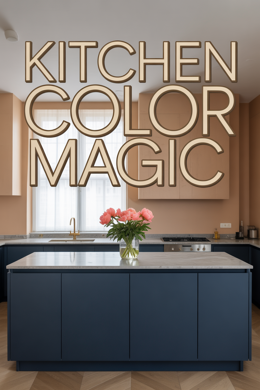
Deep, saturated colors are also making a statement, especially on cabinetry. A common approach is to use a dark color for lower cabinets paired with lighter upper cabinets or open shelving for balance.
It’s always best to choose colors you truly love for long-term happiness.
How to Coordinate Cabinet, Wall, and Floor Colors

How your cabinets, walls, and floors work together sets the tone for your kitchen. A popular two-tone cabinet approach involves using a darker color for lower cabinets and a lighter one for uppers, which makes a room feel taller.
Wall colors should complement, not compete with, your cabinetry. White and off-white walls remain the most versatile option, providing a clean canvas that works with any cabinet color.
As one of the largest surfaces, your flooring should anchor your color scheme. The undertones in your wood, tile, or vinyl flooring—whether warm yellow or cool gray—should guide your other color choices for a harmonious result.
Medium-toned wood floors are often considered the most flexible, working well with a wide range of wall colors. In open-plan homes, using the same flooring in the kitchen and dining areas is a great way to make the space feel connected.
How to Test Paint Colors with Confidence

To avoid costly mistakes, it’s very important to test paint colors in your home before you buy. Purchase sample pots and paint large boards (at least 2’x2′) that you can move around the room.
This method allows you to see how the color responds to changing light throughout the day. It also shows you how it looks next to your flooring, cabinetry, and countertops.
While digital visualization tools can be helpful for early ideas, design editors note they are no substitute for trying the real paint in your space.
Allow yourself at least 24 to 48 hours to observe a test color in all types of light. This patient approach ensures you make a final decision you’ll love for years to come.


